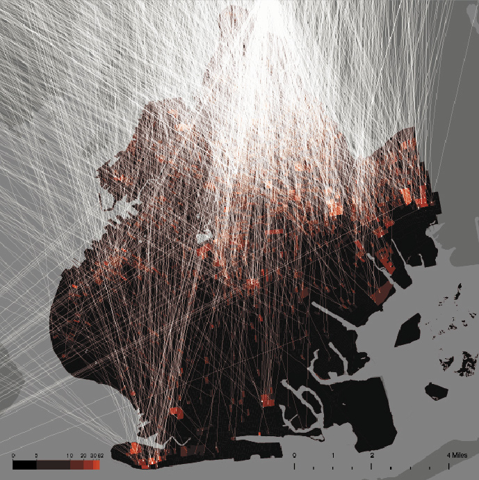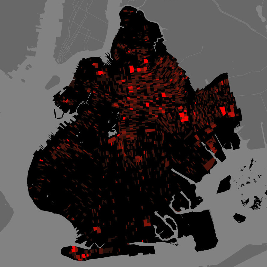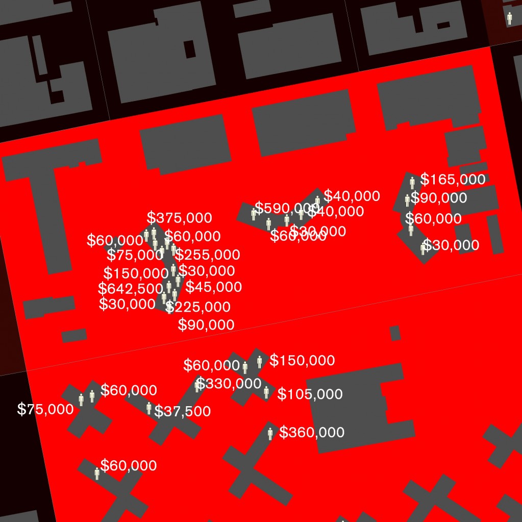
At the MoMA last week I stumbled across the elegant map-based visualizations of the Spatial Information Design Lab at Columbia’s School of Architecture. The Million Dollar Block project (pdf) explores the impact of incarceration on specific neighborhoods of New York City and Brooklyn in particular. The staggering visualizations at once depict the incredible expense of relocating Brooklynites to prison facilities in Upstate New York (amounting to mass migration) and the astonishing substitution of social services with millions of dollars per block of prison expense. They hope the visualizations will serve a diagnostic role:
Guided by the maps of Million Dollar Blocks, urban planners, designers, and policy makers can identify those areas in our cities where, without acknowledging it, we have allowed the criminal justice system to replace and displace a whole host of other public institutions and civic infrastructures.
These maps remind me of the prison labor diagrams from Linz. They monumentalize migration patterns related to imprisonment and embed a morbid story in the map of a place. As web-based map visualizations continue to expand in quality and complexity we can one day hope to tackle this issue on a more universal scale, mapping the hidden costs (externalities) of failed social policy.

