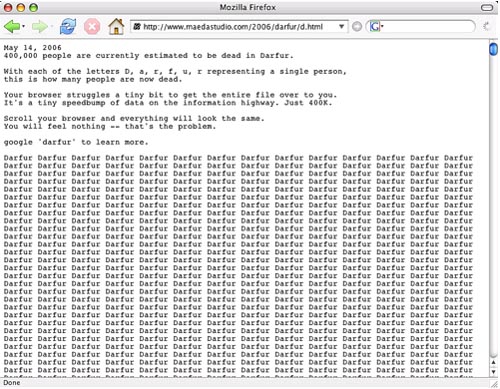
a number of stunning visualizations portray the violence our government inflicts on the world: john maeda’s text visualization of 400,000 dead in darfur,
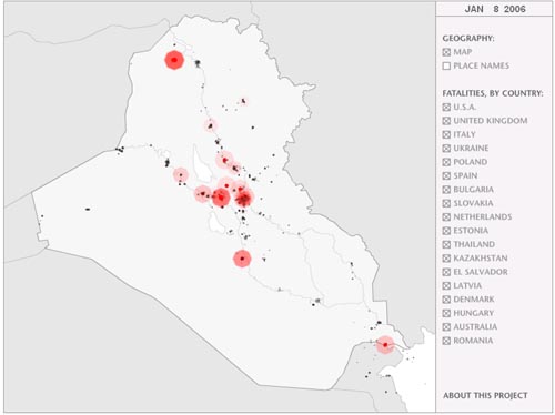
obleek.com’s animation of deaths in iraq over space and time,
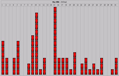
cryptome.org’s graphs of american dead in iraq,
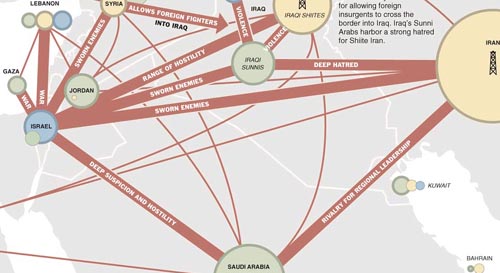
the recent new york times graphic of mideast tensions,
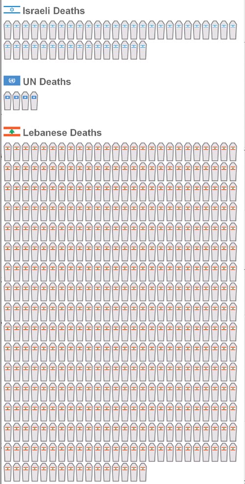
and visualisation of relative israeli UN and lebanese deaths in the current war.