


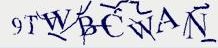


one of the concepts RAZR-designer marco susani expressed in the design intelligence conference that stuck with me for the past three years was ‘why do something with one hand when you can do it with two?‘ and so he designed a series of kitchen appliances with thin lips that forced a ceremonious handling rather than the rushed and cheap approach encouraged by plastic handles. the success of the RAZR, and the iPhone, and high heels for that matter, all come from this anti-functional design – a kind of design that makes itself noticed because it requires more attention than it has to. which brings me to captchas, those hard-to-read graphics that act as human detectors. they basically work the same reason that the iphone sells: by appealing to our sense of complexity and using our perception more than they have to. they’re also quite beautiful and reminiscent of 90’s graphic design – i would like to see some fonts inspired by these graphics used to draw in the eye, tax the attention, and make us feel more qualified to read them because “i capcha therefone i am” – and because with such a font it would be easy to overcome optical-character recognition.
design for humans
This entry was posted in product design. Bookmark the permalink. Both comments and trackbacks are currently closed.
One Comment