precious stamps

countrystamps.jpg

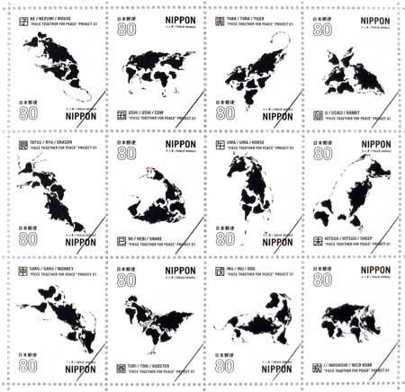
i just got back from a stamp exhibit at tokyo midtown’s design hub gallery – dozens are artists were commissioned to create stamps for the email age, when they become purely objects of art. i am still mesmerized by nagai kentaro’s piece together for peace, a collection of twelve stamps which recreate the chinese zodiac symbols out of the continents. from the top: rat, cow, tiger, rabbit, dragon, snake, horse, sheep, monkey, rooster, dog, boar. the rest of the collection is the slideshow below:

Posted in 2d, art, product design, visualization | Comments closed

ipods cause cancer

ipodcancer.jpg

i first saw japan tobacco’s surreal ‘tobacco etiquette‘ advertising campaign five years ago in the tokyo subway, and i thought it was just a unique and japanese way of discouraging smoking by appealing to a sense of communal responsibility. only yesterday did i see that the anti-smoking vignettes are interspersed with totally unrelated advice against listening to headphones (above) and wearing a backpack in the subway (below). belatedly i realized that these ‘etiquette’ ads are much more insidious than they would appear: they equate smoking with innocuous behaviors, legitimizing it; they present smoking as a mere problem of politeness, one that can be resolved with proper etiquette.

jtsmoking2.jpg

Posted in 2d, marketing, possessed products, visualization | Comments closed

pop-up catalog

haat1.jpg

i discovered issey miyake‘s haat store in aoyama (tokyo) – a line of clothing that, unlike pleats please and APOC, is totally dependent on hand-craft. the elaborately wrought pieces are made by hand either in india or japan. the line is designed by makiko minagawa, miyake’s long-time textile designer, and the focus is on the fabric, not the shape of the clothing. as an added bonus they conceived of this gorgeous pop-up catalog to highlight the subdued spring collection.


haat2.jpg

Posted in 2d, 3d, marketing, materials, open objects, tangible | Comments closed

font quiz

fontflashcards.jpg

gabriel blue cira designed font flash cards for graphic designers and other ‘yupsters’ (between yuppies and hipsters). he might even make you a set or sell them one day at yupsta.com.

Posted in 2d, futurecraft, visualization | Comments closed

company history

dnphistory.jpg

visiting DNP headquarters in gotanda (tokyo) this past week i was reminded of the japanese corporate custom of maintaining a prominent exhibit about the company’s history, its roots, regardless of how far they’ve come. at 130 years old the company is commonplace in japan, where there are over 50,000 corporations older than 100 years. beyond mere pride, this kind of museum suggests a more farsighted focus than the dominant american management style, which seeks to maximize short-term profits without regard to the longevity of the enterprise. on top of that, the design of the dnp company museum is immaculate, complete with glowing cabinets and hidden drawers containing ancient font catalogs and movable type pieces:

Posted in marketing, open objects, product design, soft/glowing | Comments closed

font building blocks

alfabetoefantasiabyleo1.jpg

yesterday i stopped by the bruno munari show in shiodome-italia and among all of the design classics one design stood out for me: alfabeto e fantasia, a set of tiles for children to write, but instead of using already-made letters, it relies on geometric primitives from which to compose – and invent – characters. of course, you can’t buy it anymore, so i reverse-designed it and i’m making it available to anyone with a laser cutter who wants to make their own. now could someone please design the font?

>free dxf download 500mmx500mm<

Posted in 2d, children, fabrication, futurecraft, open objects, product design, tangible | Comments closed

museum lab

museumlab-eyetrack.jpg

yesterday i visited dai nippon printing’s exhibit in gotanda (tokyo) called louvre museum lab – a series of interactive installations built around titian’s madonna of the rabbit. the interfaces are big and beautiful, so even though most of the curatorial content in available on-line, experiencing the museum lab in person is completely necessary. one interface tracks your eye gaze across the painting before and after having passed through the didactic interaction. in another, visitors can walk inside the painting on a touch-sensitive floor in a projected cave. yet another allows you to magnify and peer inside the painting by pointing your hand in thin air. finally, in the most physical installation a bound book prompts overhead projections that toy with the printed image. the audio soundtrack is delivered by a skull-transmitting headphone triggered by antennas in the floor. your visit is registered on RFID and you can see it all again by visiting your personalized version of the tour on-line.
the most striking aspect of such an experience is how much richness and experience a single painting can reveal, when enough information is provided in stimulating ways. i would rather spend one hour in a one-painting museum than blur through the hundreds that sit in the non-interactive lab.

Posted in animation, art, exhibit design, open objects, tangible, visualization | Comments closed

dinner demons

kobito1.jpg

do you ever feel like things are out of control? the virtual reality laboratory at tokyo institute of technology (no acronym) have discovered one reason: tiny ‘brownies’ called kobito are pushing stuff around. you can finally see them at work through the newly developed “kobito window,” a screen that shows them pushing your tea around the table when you’re not looking. the best thing is, you can finally push back – the tea, that is – and see the devastation it causes to these little creatures. having learned about them i’m sure to be on the lookout from now on – and so should you.

kobito2.jpg

Posted in evil robots, furniture, livingbreathing, possessed products, product design, tangible | Comments closed